April 28, 2022
Build A Fullstack App with Remix, Prisma & MongoDB: Referential Integrity & Image Uploads
Welcome to the fourth article of this series where you are learning how to build a full-stack application from the ground up using MongoDB, Prisma, and Remix! In this part, you will build the profile settings section of your application, including an image upload component, and configure your schema to provide referential integrity in your data.

Table Of Contents
- Introduction
- Build the profile settings modal
- Add an image upload component
- Display the profile pictures
- Add a delete account function
- Add form validation
- Summary & What's next
Introduction
In the previous part of this series you built the main areas of this application, including the kudos feed, the user list, the recent kudos list, and the kudos-sending form.
In this part you will be wrapping up this application's development by building a way for users to update their profile information and upload a profile picture. You will also make a few changes to your schema that will give your database referential integrity.
Note: The starting point for this project is available in the part-3 branch of the GitHub repository. If you'd like to see the final result of this part, head over to the part-4 branch.
Development environment
In order to follow along with the examples provided, you will be expected to ...
- ... have Node.js installed.
- ... have Git installed.
- ... have the TailwindCSS VSCode Extension installed. (optional)
- ... have the Prisma VSCode Extension installed. (optional)
Note: The optional extensions add some really nice intellisense and syntax highlighting for Tailwind and Prisma.
Build the profile settings modal
The profile settings page of your application will be displayed in a modal that is accessed by clicking a profile settings button at the top right of the page.
In app/components/search-bar.tsx:
- Add a new prop to the exported component named
profilethat is of theProfiletype generated by Prisma - Import the
UserCirclecomponent. - Render the
UserCirclecomponent at the very end of theform's contents, passing it the newprofileprop data. This will act as your profile settings button.
If your development server was already running, this will cause your home page to throw an error the SearchBar component is now expecting the profile data.
In the app/routes/home.tsx file, use the getUser function written in the second part of this series from app/utils/auth.server.ts. Use this function to load the logged in user's data inside of the loader function. Then provide that data to the SearchBar component.
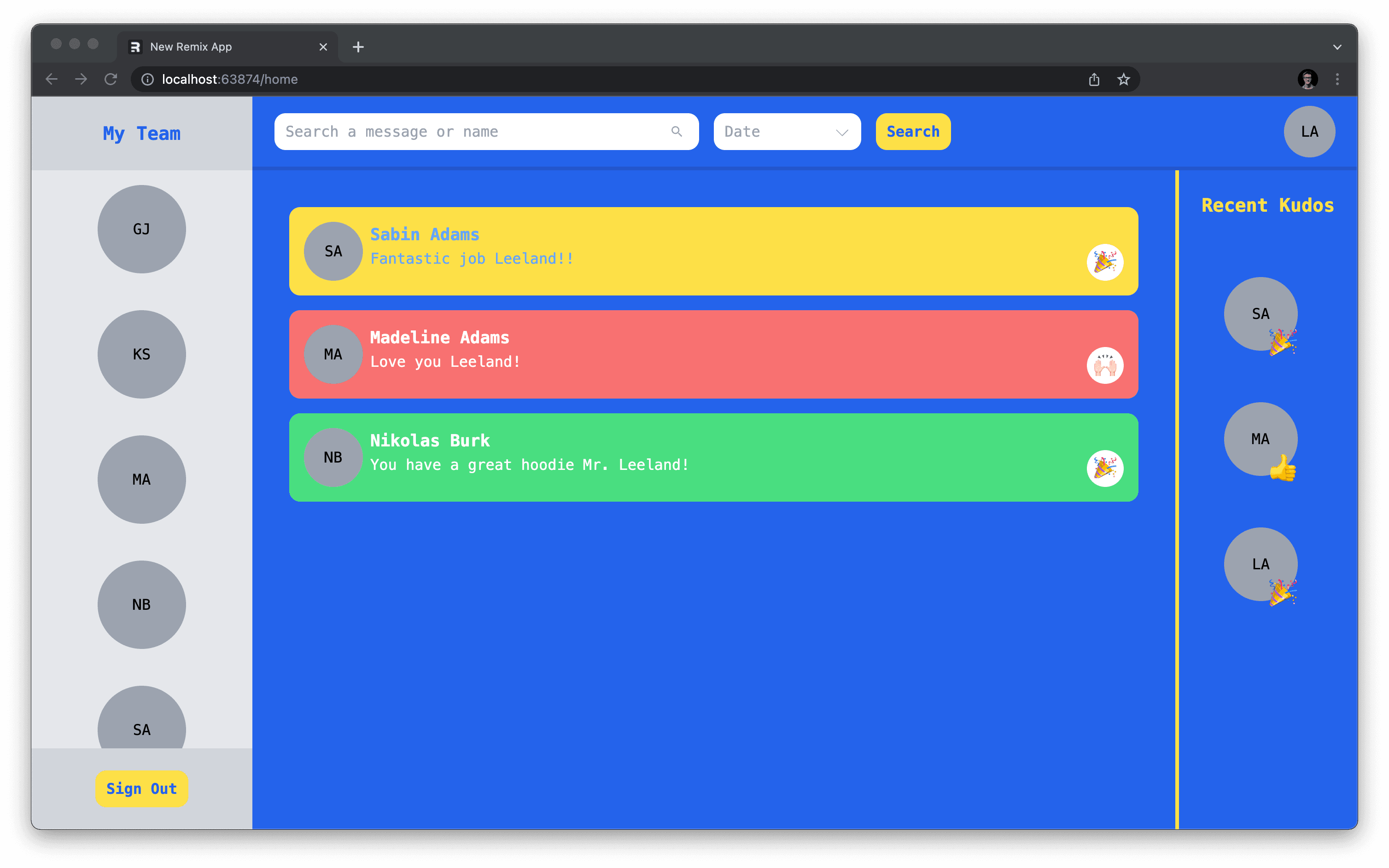
Your SearchBar will now have access to the profile data it needs. If you had previously recieved an error because of the absence of this data, a refresh of the page in your browser should reveal the profile button rendering successfully in the top right corner of the page.
Create the modal
The goal is to open a profile settings modal when the profile settings button is clicked. Similar to the kudos modal built in the previous section of this series, you will need to set up a nested route where you will render the new modal.
In app/routes/home add a new file named profile.tsx with the following contents to start it off:
The snippet above ...
- ... renders a modal into a new
ProfileSettingscomponent. - ... retrieves and returns the logged in user's data within a
loaderfunction. - ... uses the
useLoaderDatahook to access theuserdata returned from theloaderfunction.
To open this new modal, in app/components/search-bar.tsx add an onClick handler to the UserCircle component that navigates the user to the /home/profile sub-route using Remix's useNavigate hook.
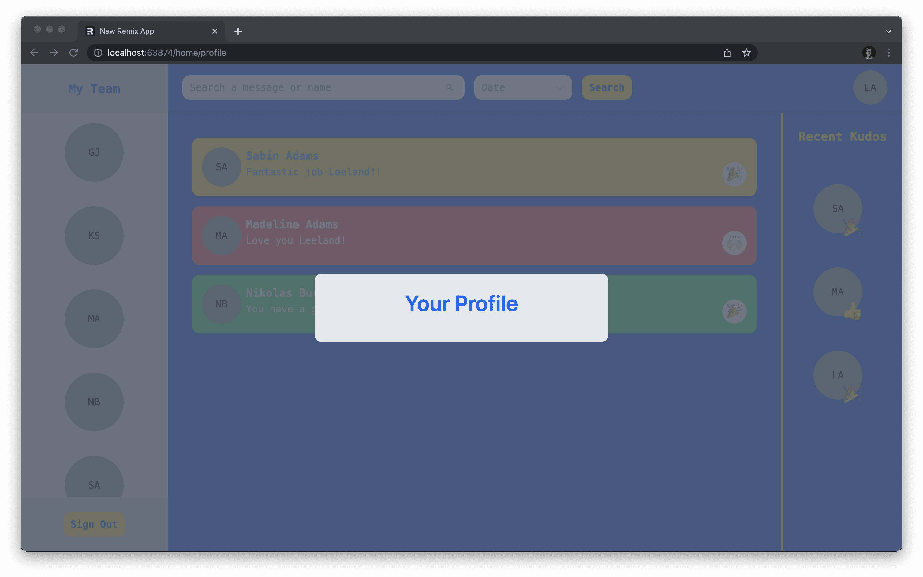
If you now click on the profile settings button, you should see the new modal displayed on the screen.
Build the form
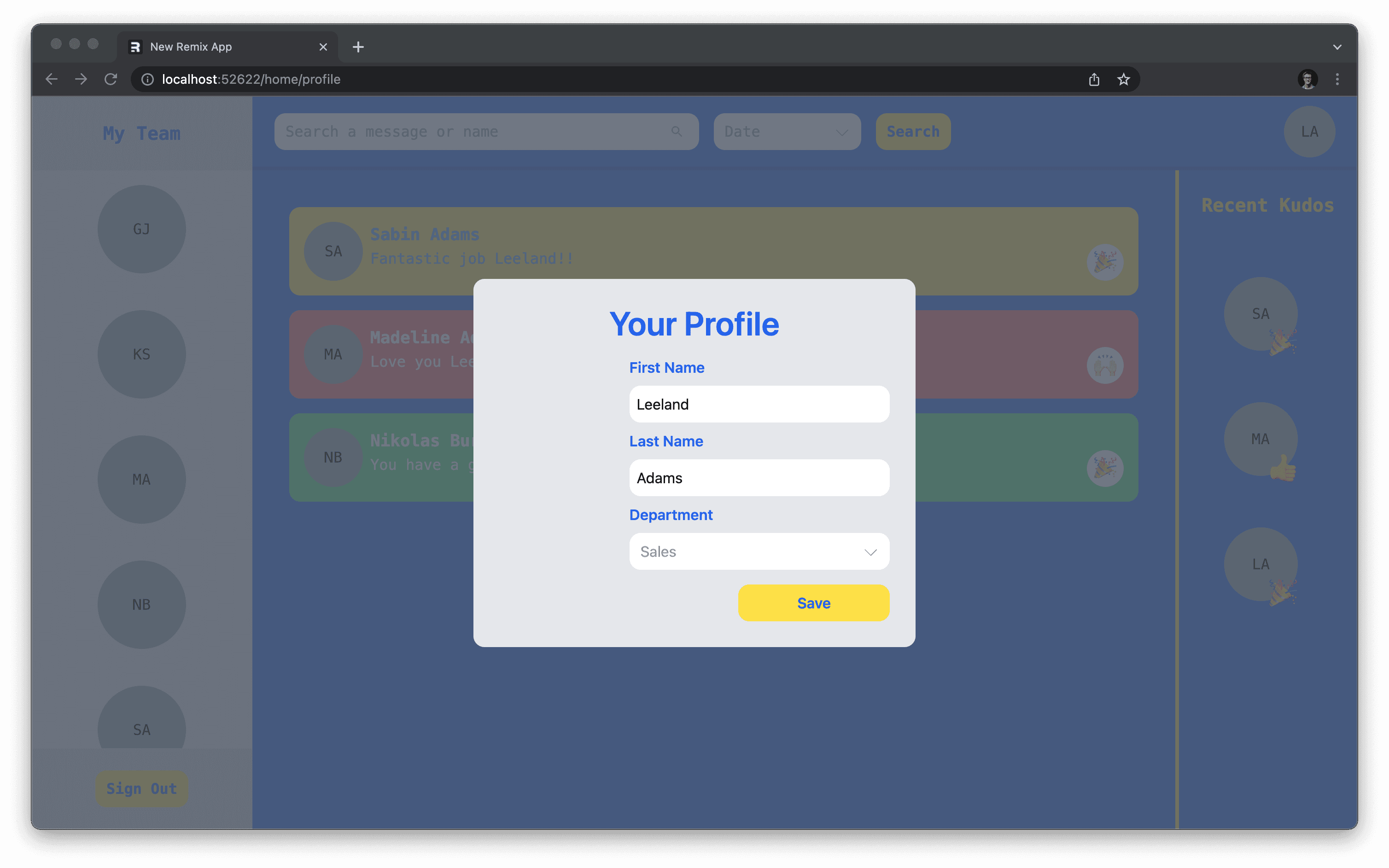
The form you will build will have three fields that will allow the user to modify their profile details: first name, last name, and department.
Start building the form by adding the first and last name inputs:
Here's an overview of what was added above:
- Added the imports needed in the changes made.
- Created a
formDataobject in state that holds the form's values. This defaults those values to the logged in user's existing profile data. - Created a function that takes in an HTML
changeevent and a field name as parameters. Those are used to update theformDatastate as input fields' values change in the component. - Renders the basic layout of the form as well as the two input fields.
At this point, there is no error handling put in place and the form does not do anything. Before you add those pieces you will need to add the department dropdown.
In app/utils/constants.ts add a new departments constant to hold the possible options defined in your Prisma schema. Add the following export to that file:
Import departments into your app/routes/home/profile.tsx file along with the SelectBox component and use them to add a new input to your form:
At this point, your form should render the correct inputs and their options. It will default their values to the current values associated with the logged in user's profile.
Allow users to submit the form
The next piece you will build is the action function which will make this form functional.
In your app/routes/home/profile.tsx, add an action function that retrieves the form data from the request object and validates the firstName, lastName and department fields:
The action function above does the following:
- Pulls out the form data points you need from the
requestobject. - Ensures each piece of data you care about is of the
stringdata type. - Validates the data using the
validateNamefunction written previously. - Redirects to the
/homeroute, closing the settings modal.
The snippet above also throws relevent errors when the various validations fail. In order to put the validated data to use, write a function that allows you to update a user.
In app/utils/user.server.ts, export the following function:
This function will allow you to pass in any profile data and update a user whose id matches the provided userId.
Back in the app/routes/home/profile.tsx file, import that new function and use it to update the logged in user within the action function:
Now when a user hits the Save button, their updated profile data will be stored and the modal will be closed.
Add an image upload component
Set up an AWS account
Your users now have the ability to update some key information in their profile, however one thing that would be nice to add is the ability to allow a user to set up a profile picture so other users might more easily identify them.
To do this, you will set up an AWS S3 file storage bucket to hold the uploaded images. If you don't already have an AWS account, you can sign up here.
Note: Amazon offers a free tier that gives you access to S3 for free.
Create an IAM user
Once you have an account, you will need an Identity Access Management (IAM) user set up in AWS so you can generate an access key ID and secret key, which are both needed to interact with S3.
Note: If you already have an IAM user and its keys, feel free to skip ahead.
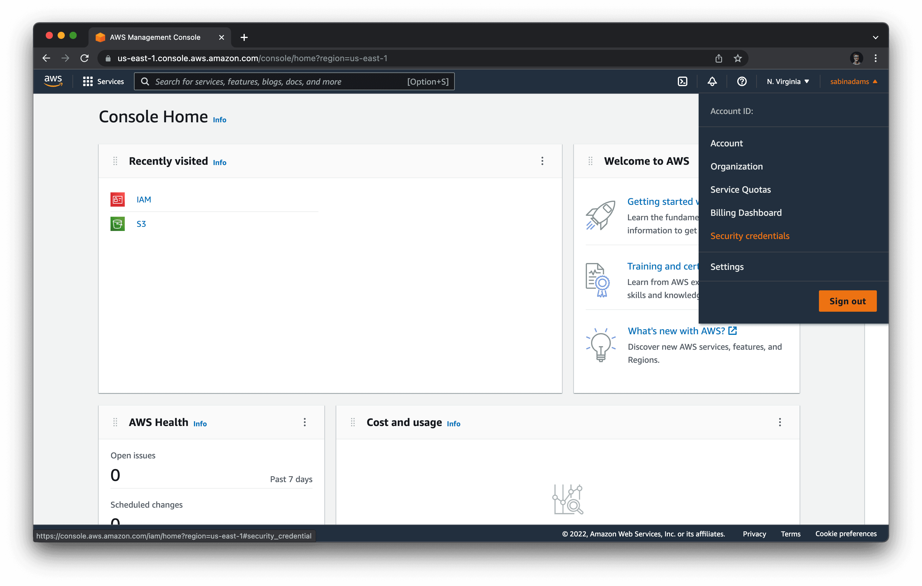
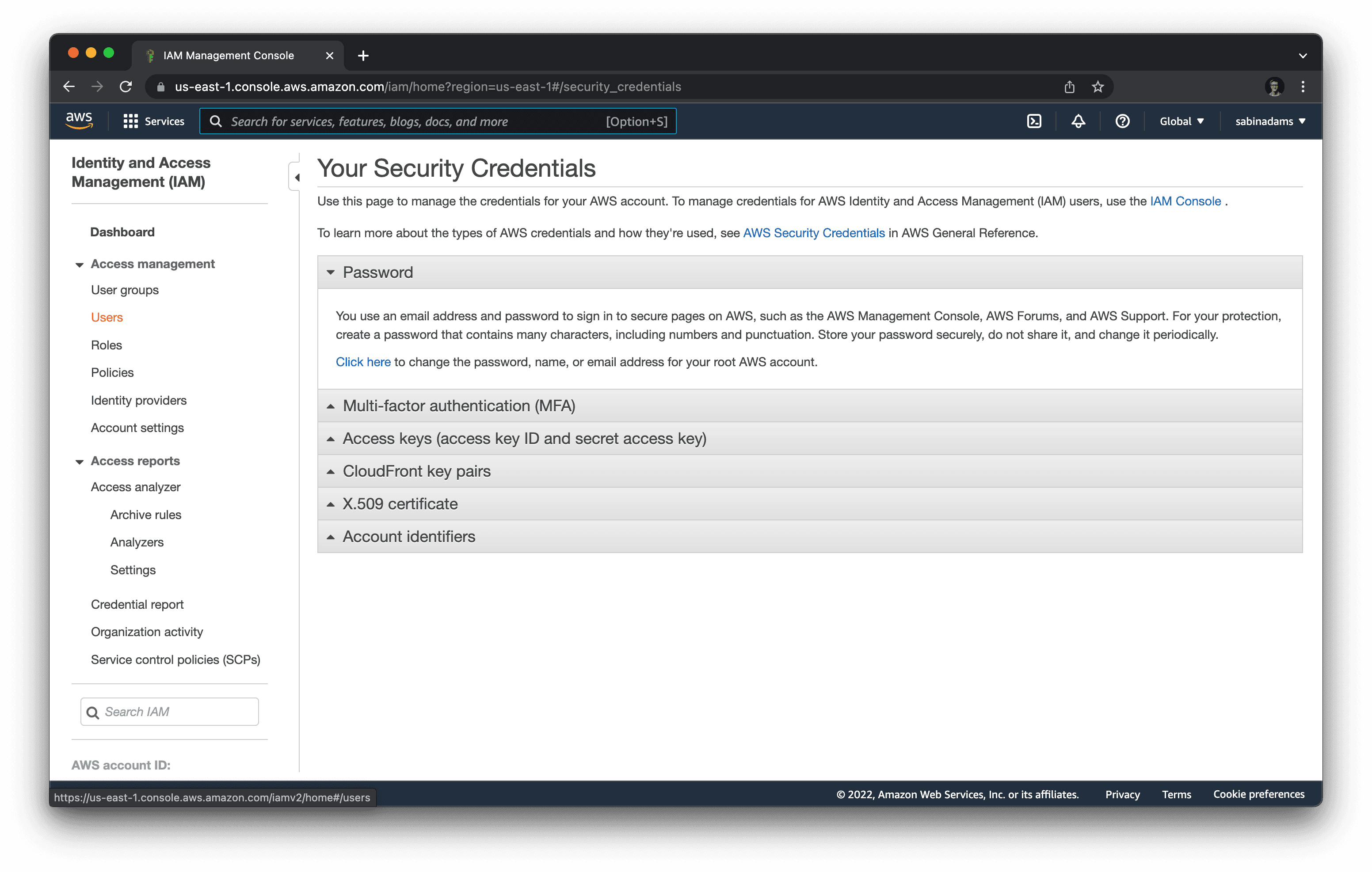
Head over to to the AWS console home page. On the top right corner of the page, click on the dropdown labeled with your user name and select Security Credentials.
Once inside that section, hit the Users option in the left-hand menu under Access Management.
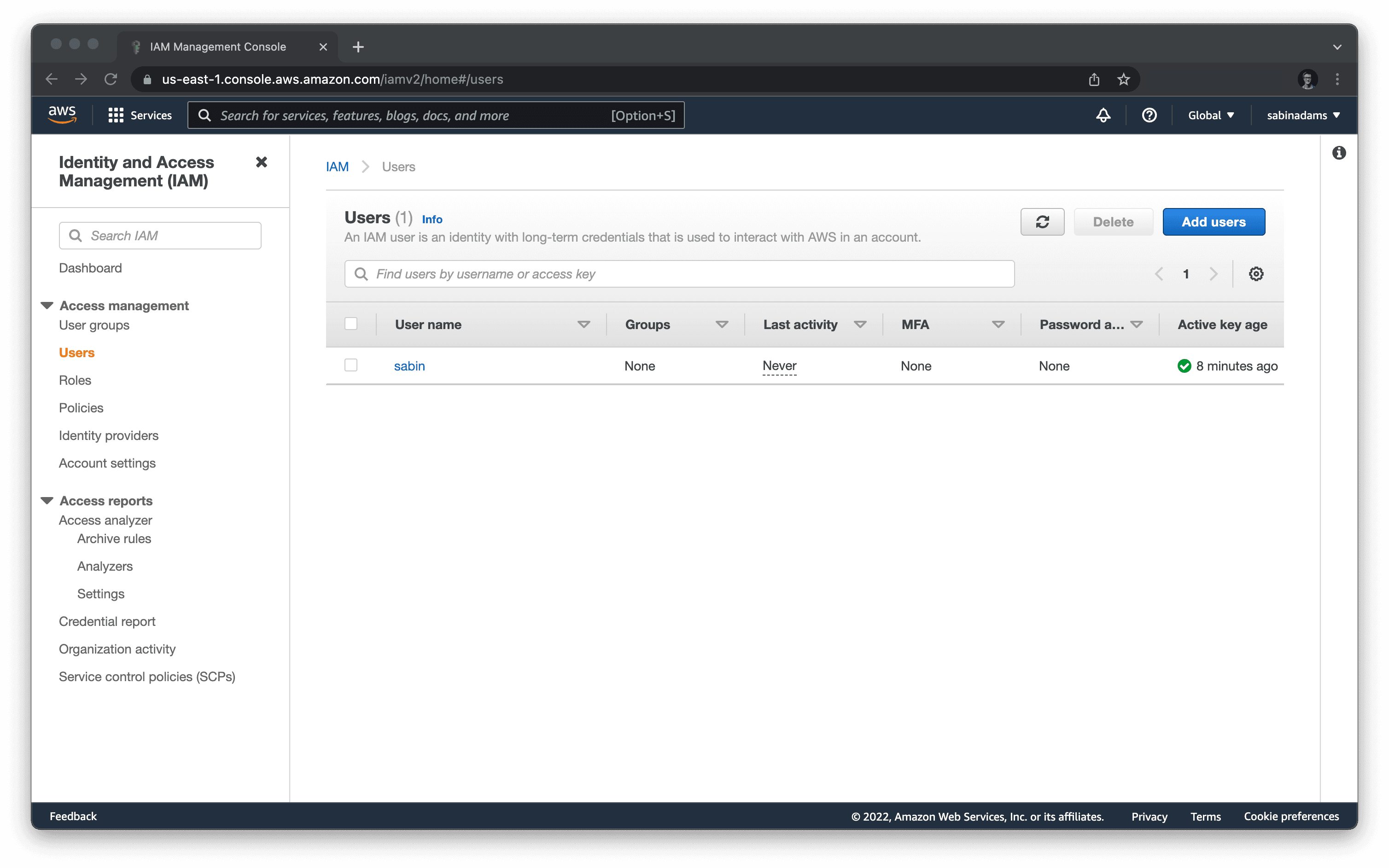
On this page, click the Add users button on the top right of the page.
This will bring you through a short wizard that allows you to configure your user. Follow through the steps below:
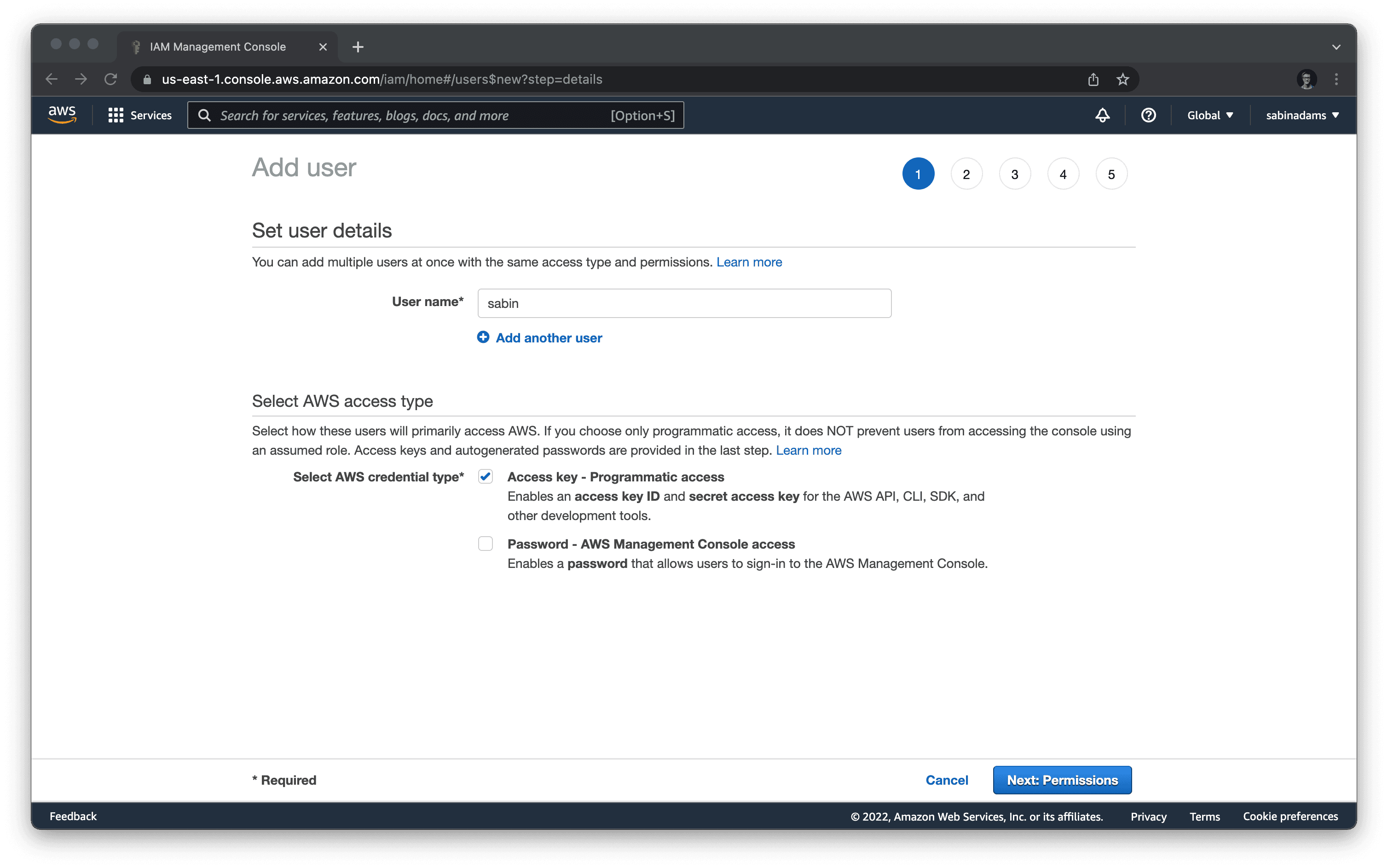
This first section asks for:
- Username: Provide any user name.
- Select AWS access type: Select the Access key - Programmatic access option, which enables the generation of an access key ID and secret key.
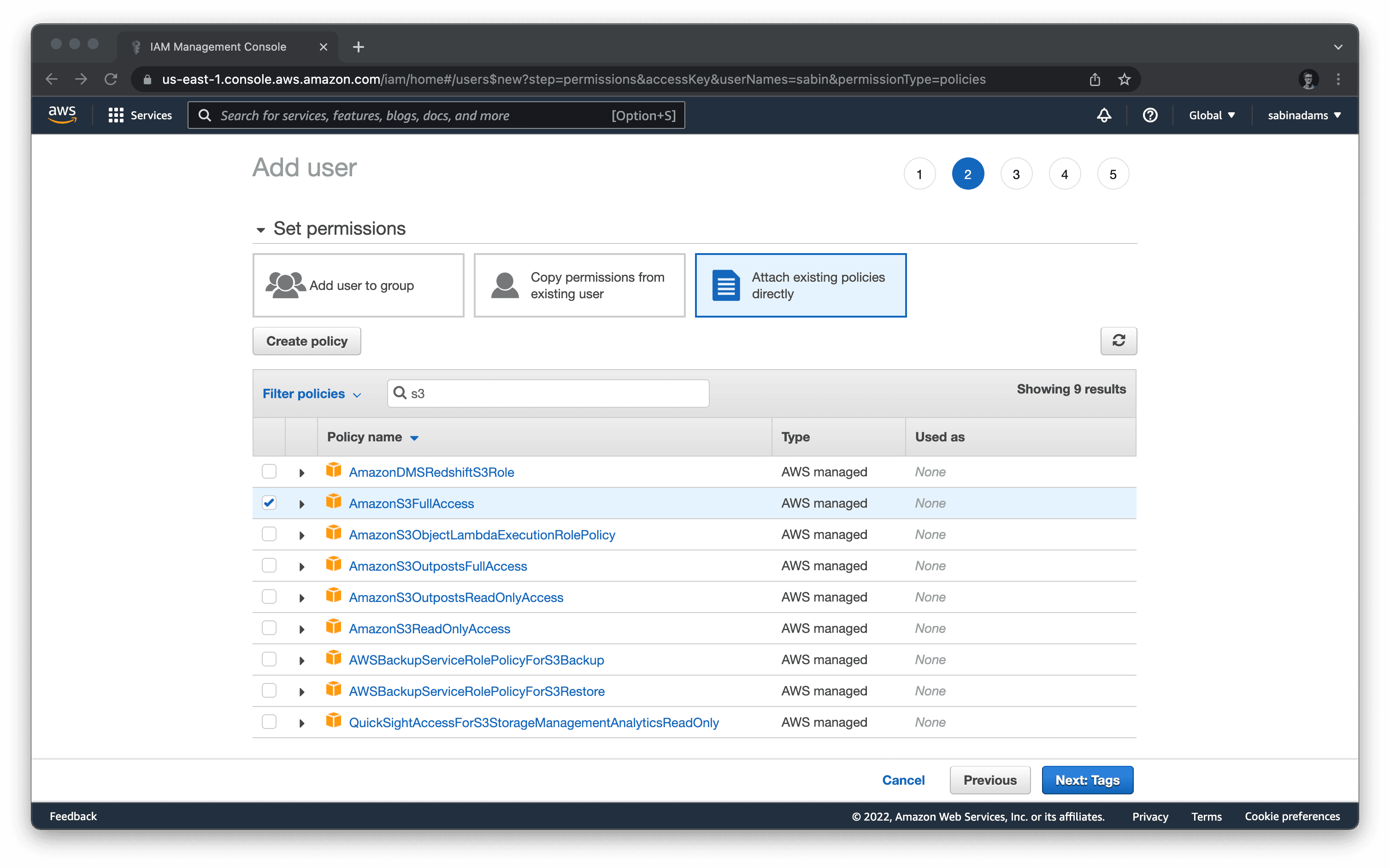
On the second step of the wizard, make the following selections:
- Select the "Attach existing policies directly" option.
- Search for the term "S3".
- Hit the checkmark next to an option labeled AmazonS3FullAccess.
- Hit next at the bottom of the form.
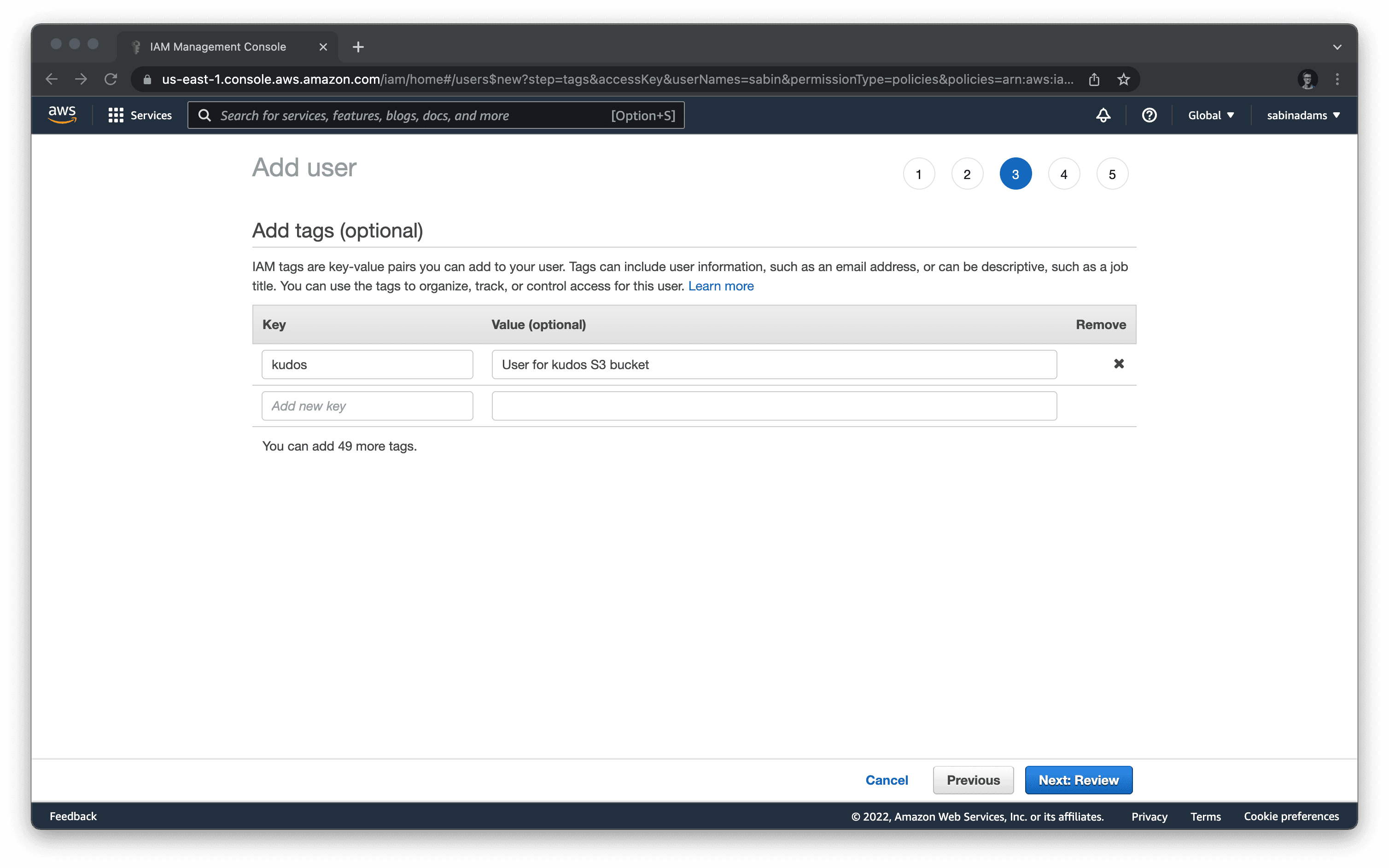
If you would like to add tags to your user help make it easier to manage and organize the users in your account, add those here on the third step of the wizard. Hit Next when you are finished on this page.
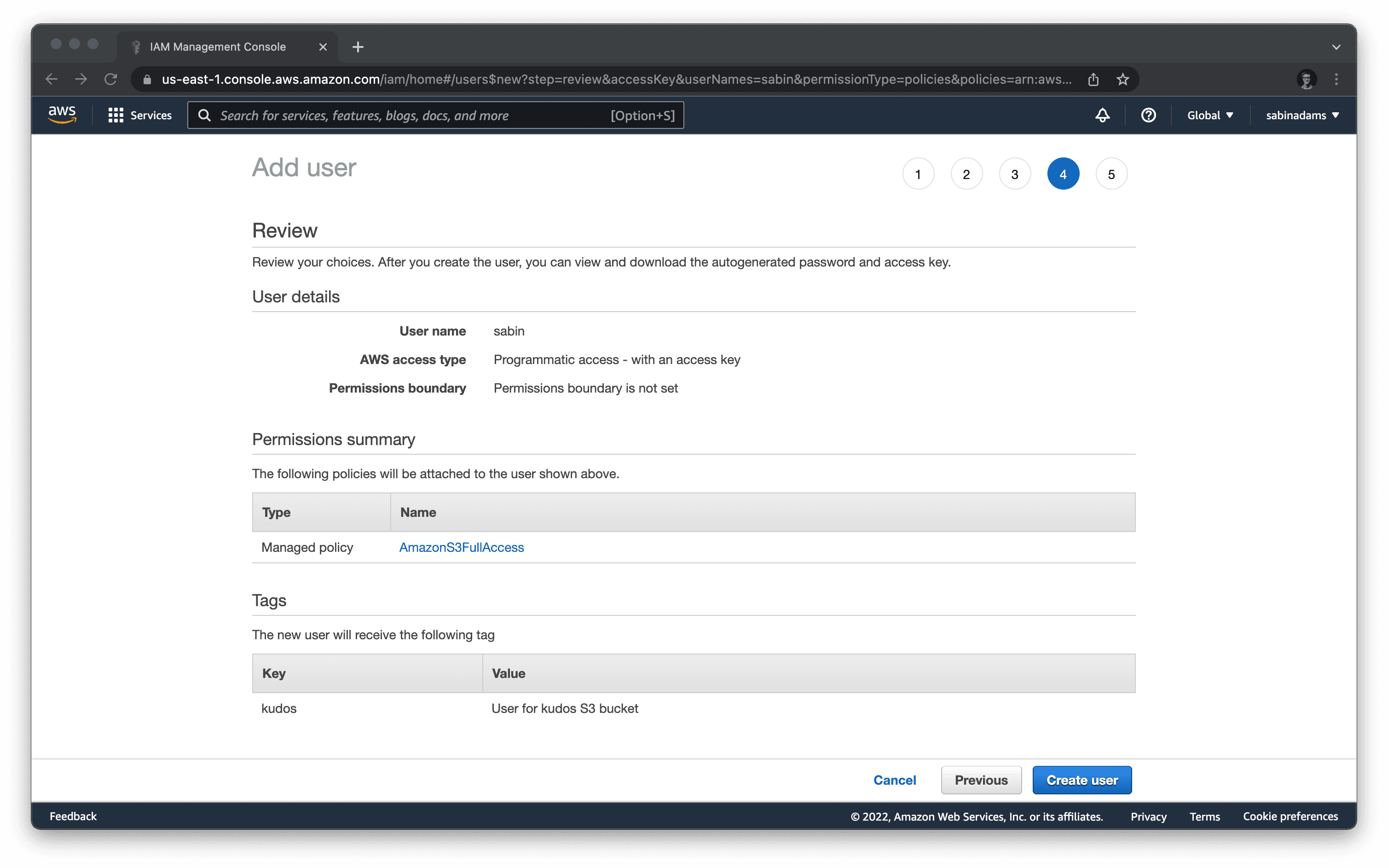
If the summary on this page looks good, hit the Create user button at the bottom of the page.
After hitting that button, you will land on a page with your access key ID and secret key. Copy those and store them somewhere you can easily access as you will be using them shortly.
Set up an S3 bucket
Now that you have a user and access keys, head over to the AWS S3 dashboard where you will set up the file storage bucket.
On the top right of this page, hit the Create bucket button.
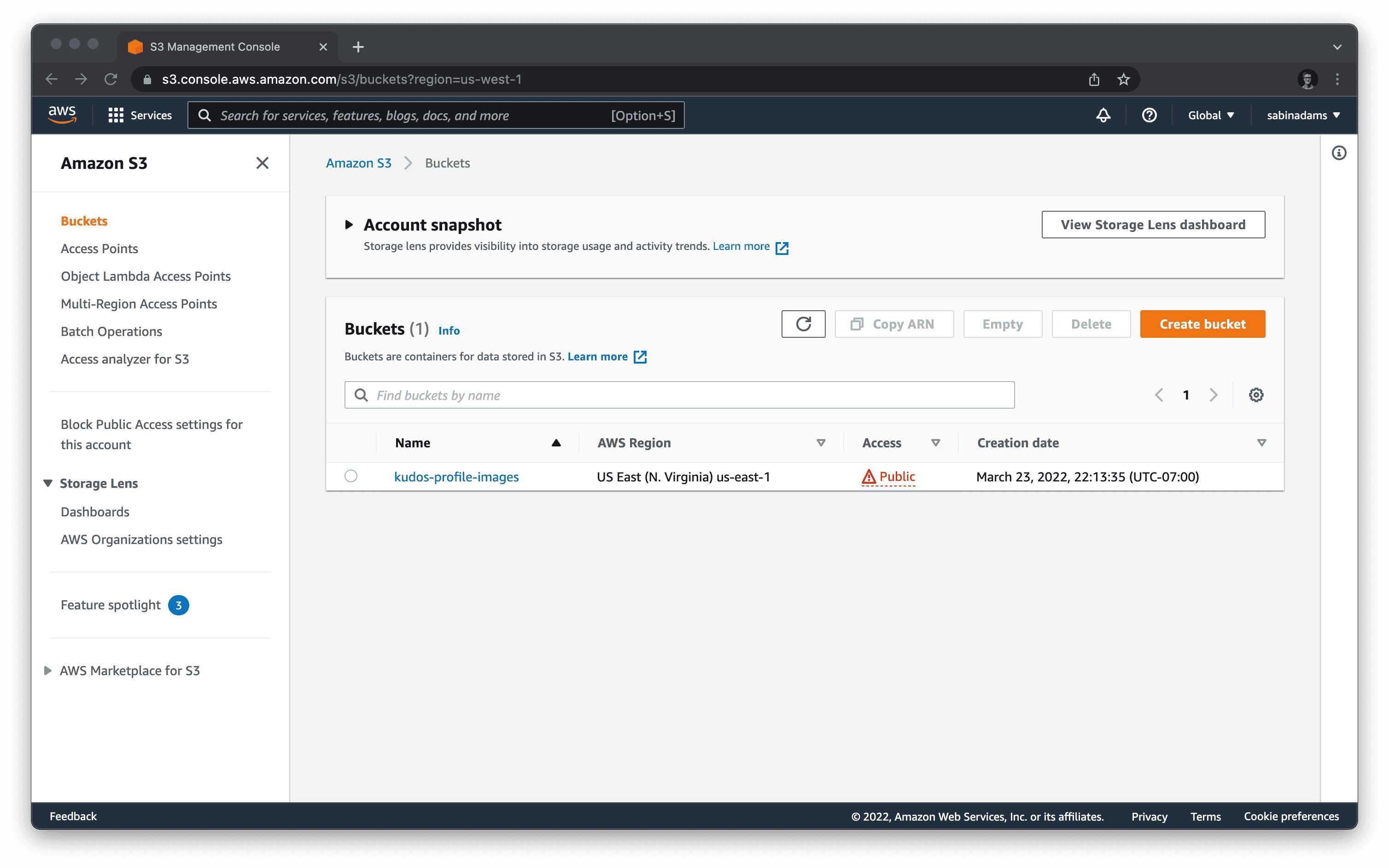
You will be asked for a name and region for your bucket. Fill those details out and save the values you choose with the access key ID and secret key you previously saved. You will need these later as well.
After filling those out, hit Create bucket at the very bottom of the form.
When the bucket is done being created, you will be sent to the bucket's dashboard page on the Objects tab. Navigate to the Permissions tab.
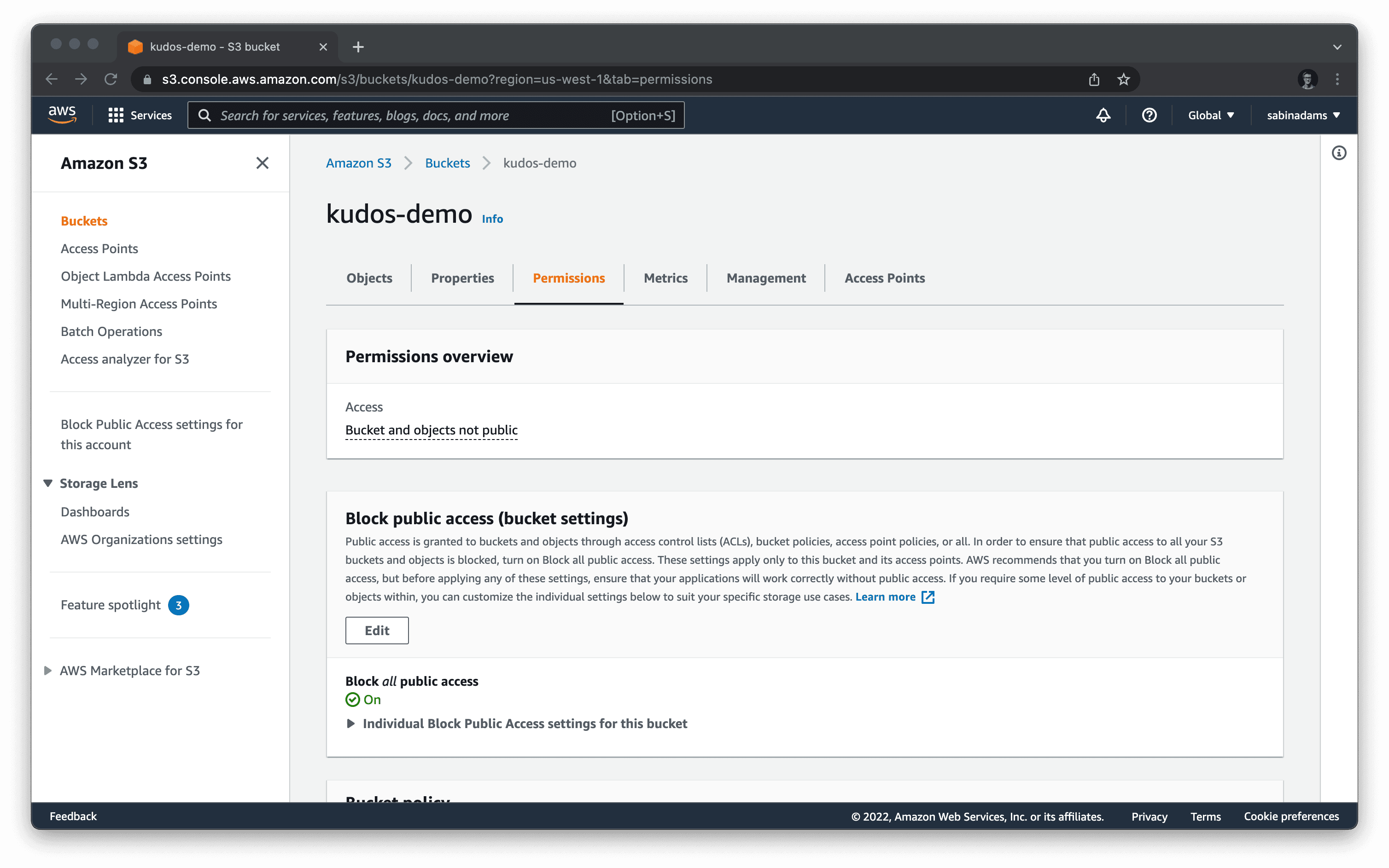
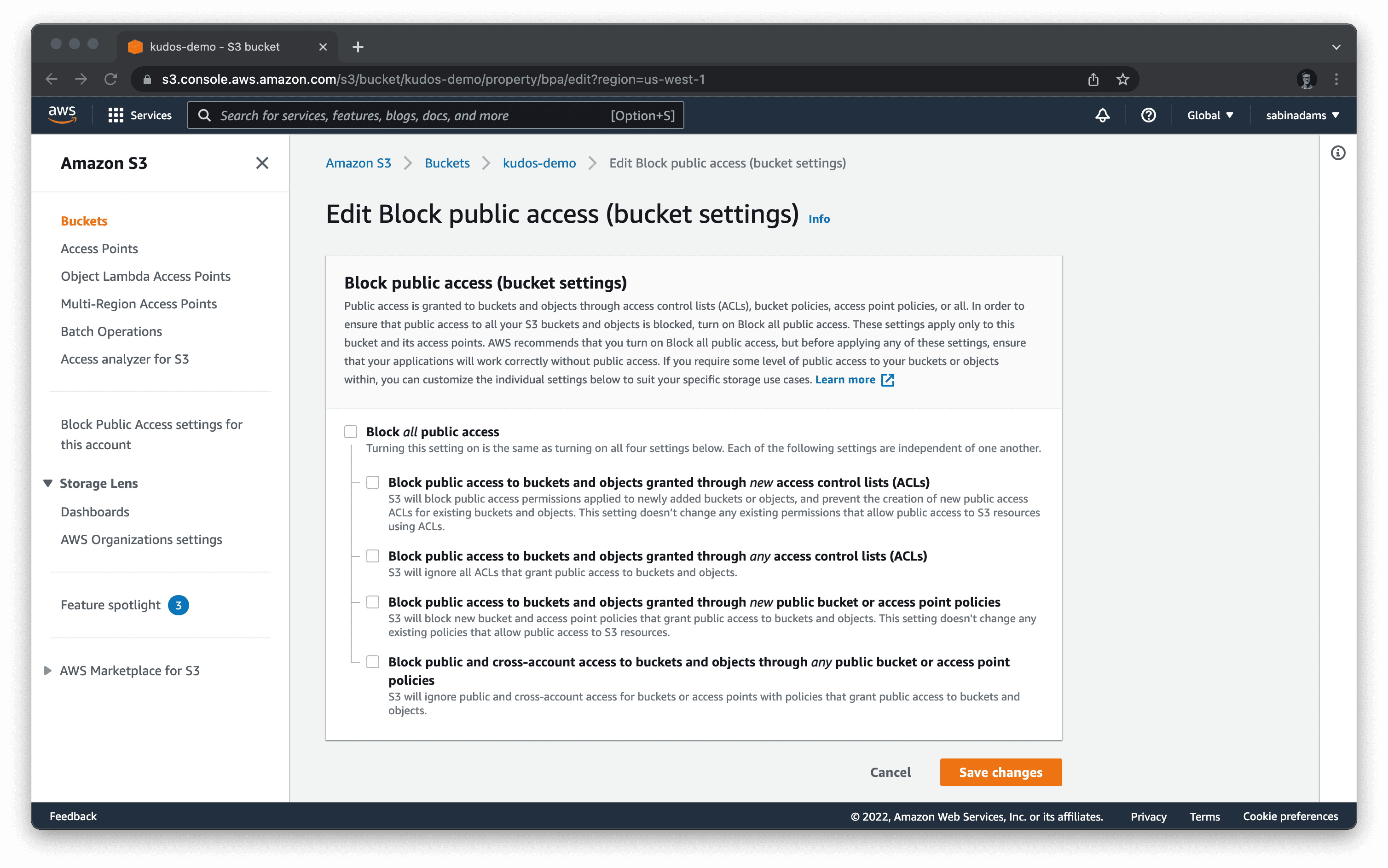
In this tab, hit the Edit button under the Block public access section. In this form, uncheck the Block all public access box and hit Save changes. This sets your bucket as public, which will allow your application to access the images.
Below that section you will see a Bucket policy section. Paste in the following policy, and be sure to replace <bucket-name> with your bucket's name. This policy will allow your images to be publicly read:
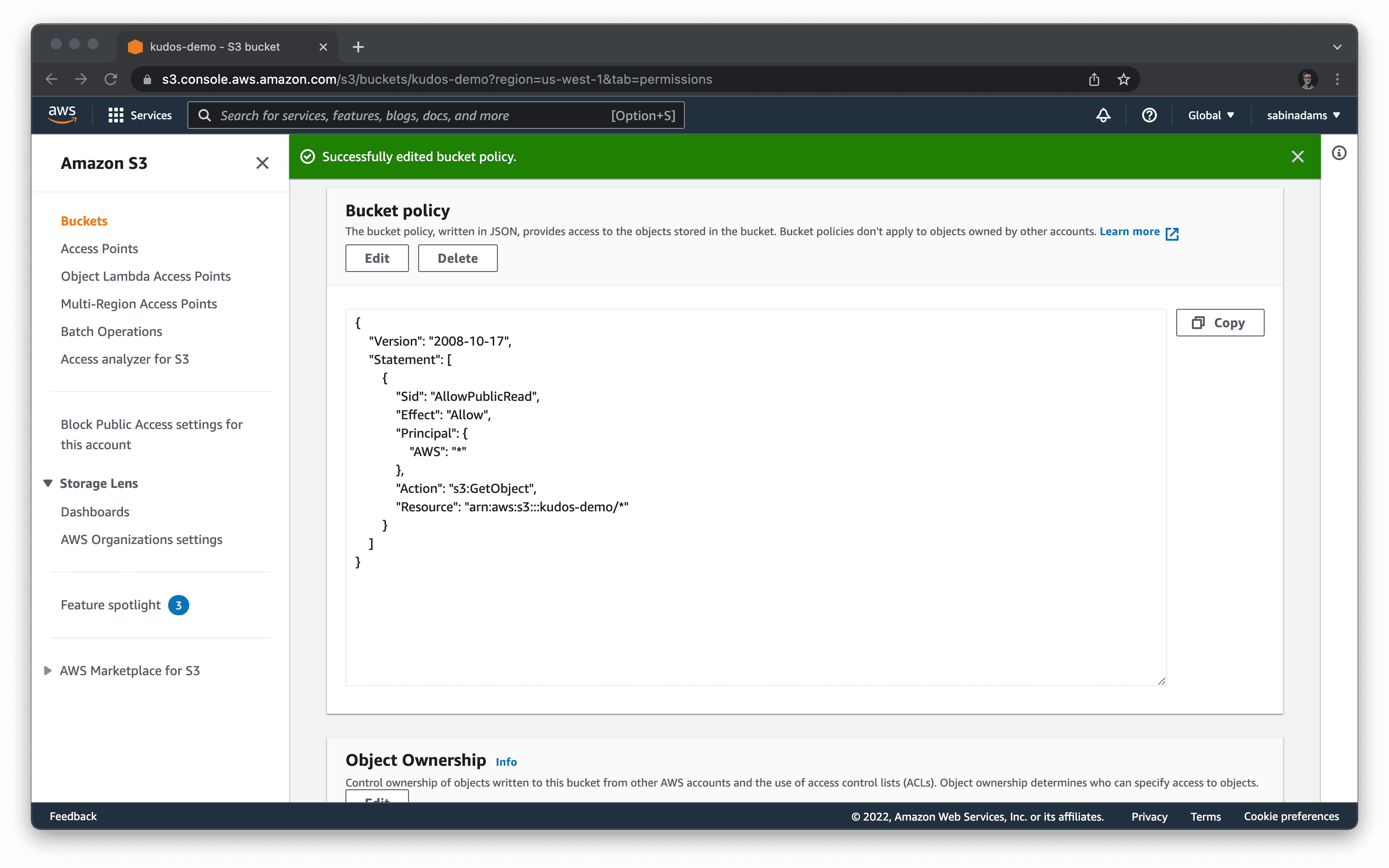
You now have your AWS user and S3 bucket set up. Next you need to save the keys and bucket configurations into your .env file so they can be used later on.
Update your Prisma schema
You will now create a field in your database where you will store the links to the uploaded images. These should be stored with the Profile embedded document, so add a new field to your Profile type block.
To update Prisma Client with these changes, run npx prisma generate.
Build the image upload component
Create a new file in app/components named image-uploader.tsx with the following contents:
The snippet above is the full image upload component. Here is an overview of what is going on:
- A
preventDefaultfunction is defined to handle changes to the file input in the component. - A
handleDropfunction is defined to handledropevents on the file input in the component. - A
handleChangefunction is defined to handle anychangeevents on the file input in the component. - A
divis rendered with various event handlers defined, allowing it to react to file drops, drag events and clicks. These are used to trigger image uploads and style changes that appear only when the element is receiving a drag event.
Whenever the value of the input in this component changes, the onChange function from the props is called, passing along the file data. That data is what will be uploaded to S3.
Next create the service that will handle the image uploads.
Build the image upload service
To build your image upload service you will need two new npm packages:
aws-sdk: Exposes a JavaScript API that allows you to interact with AWS services.cuid: A tool used to generate unique ids. You will use this to generate random file names.
Your image upload service will live in a new utility file. Create a file in app/utils named s3.server.ts.
In order to handle the upload, you will make use of Remix's unstable_parseMultipartFormData function which handles a request object's multipart/form-data values.
Note:
multipart/form-datais the form data type when posting an entire file within the form.
unstable_parseMultipartFormData will take in two parameters:
- A
requestobject retrieved from a form submission. - An
uploadHandlerfunction, which streams the file data and handles the upload.
Note: The
unstable_parseMultipartFormDatafunction is used in a way similar to Remix'srequest.formDatafunction we've used in the past.
Add the following function and imports to the new file you created:
This code sets up your S3 API so you can iteract with your bucket. It also adds the uploadHandler function. This function:
- Uses the environment variables you stored while setting up your AWS user and S3 bucket to set up the S3 SDK.
- Streams the file data from the
requestas long as the data key's name is'profile-pic'. - Uploads the file to S3.
- Returns the
Locationdata S3 returns, which includes the new file's URL location in S3.
Now that the uploadHandler is complete, add another function that actually takes in the request object and passes it along with the uploadHandler into the unstable_parseMultipartFormData function.
This function is passed a request object, which will be sent over from an action function later on.
The file data is passed through the uploadHandler function, which handles the upload to S3 and the formData gives you back the new file's location inside of a form data object. The 'profile-pic' URL is then pulled from that object and returned by the function.
Put the component and service to use
Now that the two pieces needed to implement a working profile picture upload are complete, put them together.
Add a resource route that handles your upload form data by creating a new file in app/routes named avatar.ts with the following action function:
The function above performs these steps to handle the upload form:
- Grabs the requesting user's
id. - Uploads the file past along in the request data.
- Updates the requesting user's profile data with the new
profilePictureURL. - Responds to the
POSTrequest with theimageUrlvariable.
Now you can use the ImageUploader component to handle a file upload and send the file data to this new /avatar route.
In app/routes/home/profile.tsx, import the ImageUploader component and add it to your form to the left of the input fields.
Also add a new function to handle the onChange event emitted by the ImageUploader component and a new field in formData variable to store the profile picture data.
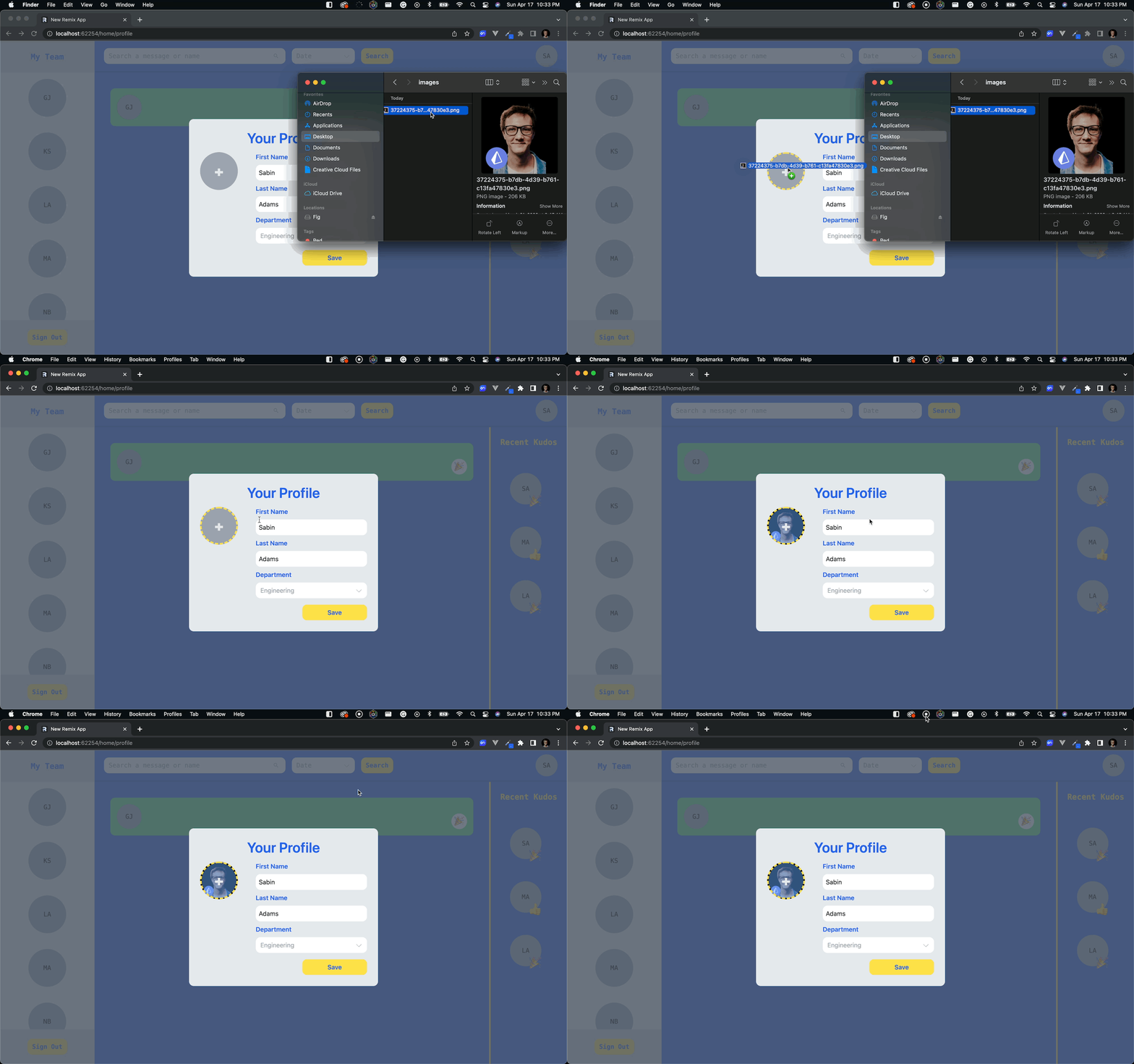
Now if you go to that form and attempt to upload a file the data should save correctly in S3, the database, and in your form's state.
Display the profile pictures
This is great! The image upload is working smoothly, now you just need to display those images across the site wherever a user's circle shows up.
Open the UserCircle component in app/components/user-circle.tsx and make these changes to set the circle's background image to be the profile picture if available:
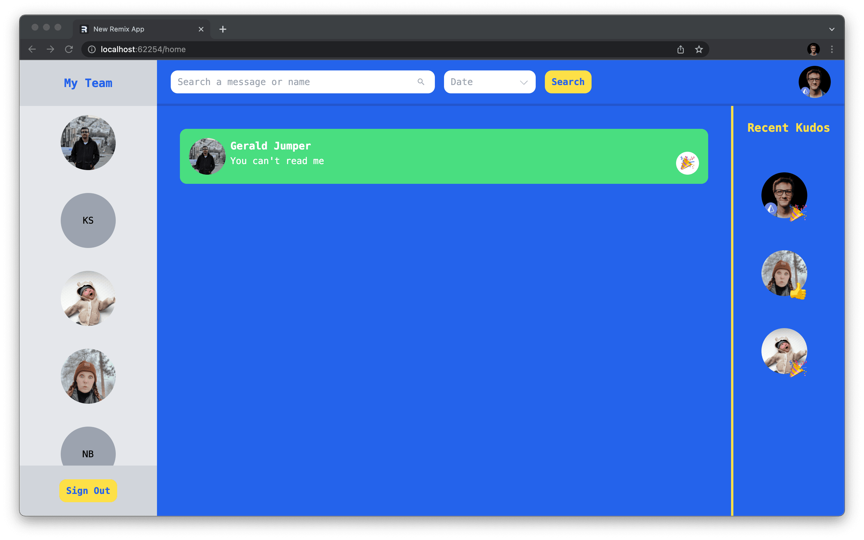
If you now give a couple of your users a profile picture, you should see those displayed throughout the site!
Add a delete account function
The last piece of functionalty your profile settings modal needs is the ability to delete an account.
Deleting data, especially in a schemaless database, has the possibility of creating "orphan documents", or documents that were once related to a parent document, but whose parent was at some point deleted.
You will put in safeguards against that scenario in this section.
Add the delete button
You will handle this form in a way similar to how the sign in and sign up forms were handled. This one form will send along an _action key that lets the action function know what kind of request it receives.
In app/routes/home/profile.tsx make the following changes to the form returned in the ProfileSettings function:
Now depending on the button clicked, you can handle a different _action in the action function.
Update the action function to use a switch statement to perform the different actions:
Now if the user saves the form, the 'save' case will be hit and the existing functionality will occur. The 'delete' case currently does nothing, however.
Add a new function in app/utils/user.server.ts that takes in a id and deletes the user associated with it:
You may now fill out the rest of the "delete" case on the profile page.
Your users can now delete their account!
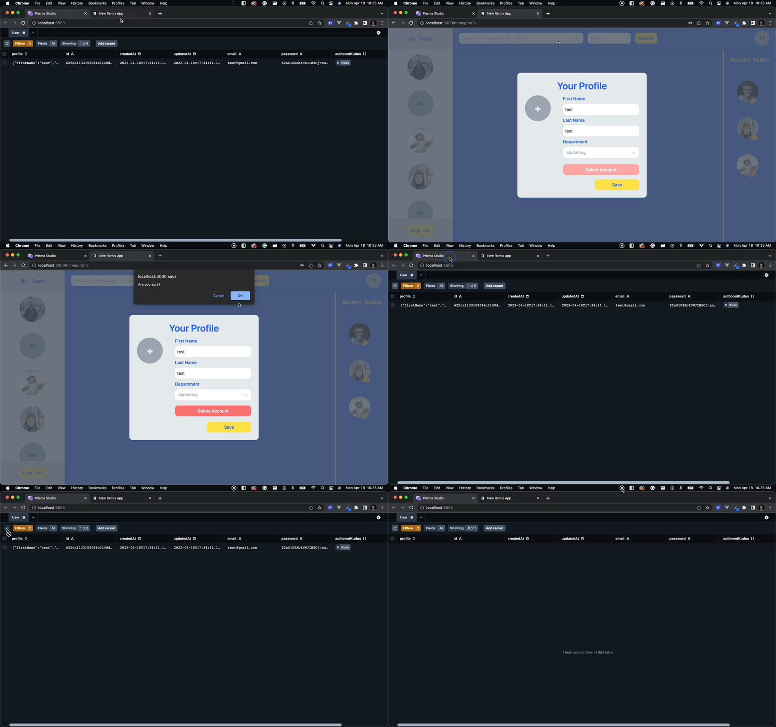
Update the data model to add referential integrity
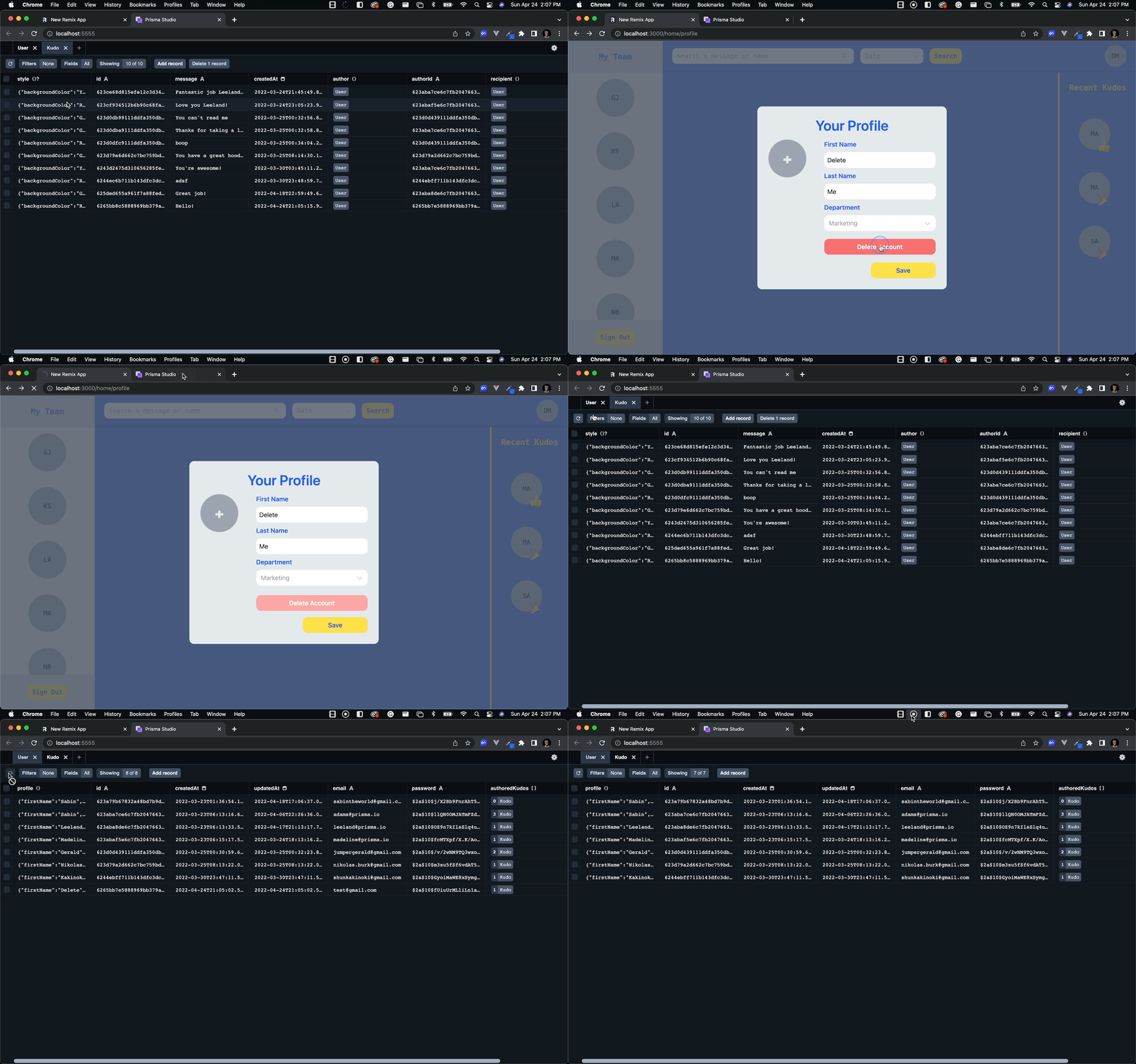
The only problem with this delete user functionality is that when a user is deleted, all of their authored kudos become orphans.
You can use referrential actions to trigger the deletion of any kudos when their author is deleted.
Run npx prisma db push to propagate those changes and generate Prisma Client.
Now if you delete an account, any Kudos authored by that account will be deleted along with it!
Add form validation
You're getting close to the end! The final piece is to hook up the error message handling in the profile settings form.
Your action function is already returning all of the correct error messages; they simply need to be handled.
Make the following changes in app/routes/home/profile.tsx to handle these errors:
The following changes were made in the snippet above:
- The
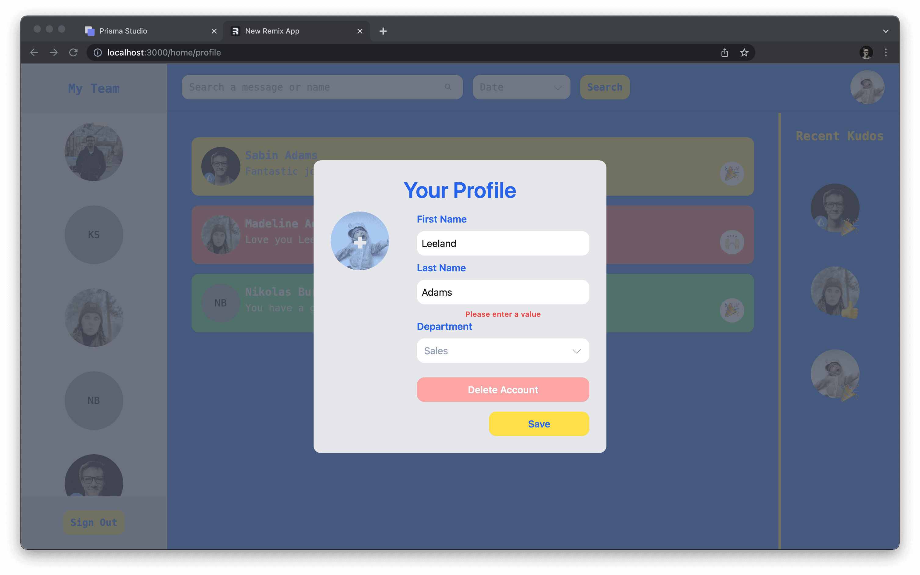
useActionDatahook was used to retrieve the error messages. Those were stored in state variables and used to populate the form in the case that a user is returned to the modal after submitting a bad form. - An error output was added to display any form-level errors.
- Error data was passed along to the
FormFieldcomponents to allow them to display their field-level errors if needed.
After making the changes above, you will see any form and validation errors are displayed on the form.
Summary & What's next
With the changes made in this article, you successfully finished off your Kudos application! All pieces of the site are functional and ready to be shipped to your users.
In this section you learned about:
- Nested routes in Remix
- AWS S3
- Referrential actions and integrity with Prisma and MongoDB
In the next section of this series you will wrap things up by taking the application you've built and deploy it to Vercel!
Don’t miss the next post!
Sign up for the Prisma Newsletter